Sunday 31 January 2010

I enjoyed the Q.

But the rest of it? Ugh. I was trying to contruct a vectored quiche, and while I failed in that respect, it did create rather a lovely Q form... so I decided to try and construct the rest of the alphabet in similar style. Some of the letters work really well... the Q, the A, the V, and the P... but most of them just look contrived and downright ugly.

As for legibility? Pah! And don't even mention the kerning issues.

But I've wasted approximately an hour of my Sunday afternoon doing this, so I'm going to show you anyway.


Friday 29 January 2010

More M is for Mountains

Right, I've decided I'm going to make these into a book when I've finished.
If it's super amazing I shall send some out to potential employers, and sell the others for real money!
If it's just ok, I shall probably give one to my mum and then forget about it.
If it's rubbish... well, I probably won't even get to the stage of making it into a book.

Anyway, I'm not going to post all the pictures on here, because if it does turn out to be super amazing, no one will buy one if they can see all the pictures here. (Yeah, because I know you're all HANGING ON MY EVERY WORD to find out what the next letter is going to be, right?) :D

Anyway, here's a sneak preview of some others. I've done as far as 'O'. (But not K, or N, and need a better F and E) Martin the science teacher is giving me all sorts of helpful suggestions, but somehow I didn't think 'Oestrogen', 'Occipital' or 'Oncologist' would be quite right. He did suggest Orbit though, which is genius.


Wednesday 27 January 2010

M IS FOR MOUNTAIN

Ok, so, I had this dream... and I dreamt that I did a whole project entitled 'M is for mountains'. It also included 'A is for Avalanche' and 'B is for buttons'. That's where the dream ended... but seriously, this was a very insistent dream, it lasted a whole night, and I kept half waking up and feeling the uncontrollable urge to makes notes in my notebook to make sure I wouldn't forget it in the morning. The notes mostly consisted of 'M is for mountain!' in various different degrees of messy handwriting... But anyway, I decided to indulge my subconscious.
'C is for cup' is the weakest, mainly because it wasn't thought up by my sleeping brain. I'm going to have to hope the rest of the alphabet comes to me in another dream.

This makes me sound like some kind of crazy hippy. I don't generally live my life according to what my dreams tell me to do, but this seemed like a fairly harmless one to act out in real life :D

Oh yeah, and everything had to be RED


If you happen to think of words that also look a bit like their initial letters... do let me know.

Tuesday 26 January 2010

You should probably go to this.

And not just because I designed the poster. Because it looks AMAZING.
Another one for the 405

For Michael...

Who is tired of jumping through hoops.


I'd have done this better if I had more time before work.

Sunday 24 January 2010

Perfume developments.

Crit on Friday, lots of things were said, and although they were not all good things, I did leave feeling quite enthusiastic.
They hated the one with the hair. Which I expected. While they liked the cover with all the grey figures they agreed it was too scientific, but they really liked my earlier work with the photos.
So this is combining the two...


My main issue with the photos was that there weren't any with enough people in. So using my cunning/debatable photoshop skills, I made a picture with LOTS OF PEOPLE! To hide it's dubious photoshoppery, I turned it on it's side, greyscaled it, and reflected it. Voila! That's a pretty nice cover there, but what about some text, and... how to make those people smell?

Well, it all looked a bit 'clunky' if I just put the text and circles directly onto the image, so to get around this I've come up with a nifty tracing paper overlay, which I think looks really nice. It's stuck just down the spine, and printed with the scent circles and type. Here it is:


When the two are overlaid together, it would hopefully look something like this:


So I made it, and, well, it does.


The competition doesn't end till April, and I want to enter (and WIN!) so I optimistically hope to do something better than this by then.

Thursday 21 January 2010

And now for something completely different.


Today I met Noma Bar who is my new Graphic Design hero.
I showed him my Perfume book jacket, and he thought it looked like a science book. I told him what the plot of the book was, and he said he thought it sounded like a sinister, but sensual book. Which it is. And that my design should reflect this more. Which it should. Then and there he proceeded to sketch out one of his amazing 'negative space' illustrations, involving a nose and a scent bottle and a person, which also conveniently formed a skull. Because the man is a genius.
But unfortunately that was HIS idea.
And, deep down I knew already, but he confirmed to me, I need to come up with something better.
This is not it, but it has killed a couple of hours of the afternoon, and given me a newfound appreciation for hair.


He said something in our lecture this morning about the book jacket being an amazing format, because you have the front, the back and the spine forming one continuous whole, whilst also having to work as separate elements by themselves. (As evidenced in his book, 'negative space') It made me think about my previous design, and how, really, that was three separate elements, but not a whole. Unfortunately, this is a whole, but doesn't really work as three separate elements. i.e. It looks nice when you view it like this, and the back looks nice, but the cover looks a bit rubbish. Boo.

Come ON Emma, this is due in TOMMOROW! Time to pull something amazing out of the bag... any time now would be good, brain.

Wednesday 20 January 2010

Perfumed with the stench of inevitable deadline

Hmmm...
Turns out we have a critique on the 'Perfume' project this Friday. I was under the impression that I didn't really have to get it finished, just have 'ideas'... turns out I was wrong.
I've spent a while working on this. Initially I hated it and thought it struck totally the wrong tone for the book, but then remembered that the whole point is to break with cliche.
So here we go.
Now I really like it.
It still needs work, yes, but I'm more pleased with it than I expected to be.

Front:


Back:

Monday 18 January 2010

This is what I want to do. Only better.

Ok, Perfume. Have you read it?
If not, here's my short synopsis. Guy is born with the most extraordinary sense of smell, but curiously has no body odour of his own. He generally finds the smell of humans repulsive and overpowering, with the exception of the occasional person - always young virgins, who contrarily have the most sublime smell imaginable to him. He gets an internship with a perfumer, learns how to make perfumes, then kills the girls to make a perfume out of their scent. The ending of the book is weird and *spoiler* involves a mass orgy and cannibalism.

Now, all the existing covers for the book are pretty cliched - dark, moody, lots of flesh tones, redc colours, and beautiful ginger girls (all the girls he kills have auburn hair)

I really really want to escape from this, and produce something that is hopefully striking and intriguing, but not blindingly obvious in terms of inspiration.

Amongst other ideas, I'm interested in the concept that every individual person has this strong smell which emanates from them in waves, and I want to represent this visually.
At the moment I'm really inspired by things like this, this, this, this and this
Possibly the wrong area to get inspiration from, because they're mainly books full of cold hard facts, wheras this is a novel... but oh well, I'm going with it anyway.

BUT, these are just ideas. I really need to go back to this location with a group of people who are dressed slightly less conspiciously 21st century (i.e. black, long skirts on the girls, no trainers etc), arrange them in a nicer fashion, and get some better shots to work with. I also need to work on what kind of circles I'm going to use, what kind of typeface... basically everything.
I do like the blue and grey though.

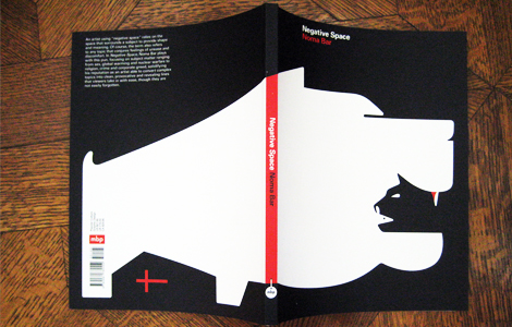
Here are some ideas so far.


Sunday 17 January 2010

Location hunting...

I went for a walk today. A walk with a mission!
I'm huntin' locations.


This made me smile... this brother and sister were cycling along...


And then the little girl fell off. Below are her parents running to help her up.


As you may or may not be able to tell, I'm looking for places where I can photograph people from above.
I have found, I think, a good location, just the other side of Rottingdean.

With that in mind, I'm looking for 9-10 volunteers, willing to dress in dark colours, pay the £3.60 return bus fair, and all come and wander round at once while I photograph them from above.
Any takers...?
Anyone?
I'll settle for 7 or 8 volunteers?
No?

Oh never mind.
(Seriously though, what with assessments and all, I'm not expecting to get this done in time for next week when it's due. But I'd still like to do it some time after that, so if you are willing to help I'd be eternally grateful.)

Thursday 14 January 2010

You should visit the library.


I cannot express enough enthusiasm for libraries. Seriously... Books! Who can't love books? You can read about pretty much everything the world has ever bought into existence, and in libraries you can enjoy the magic of just browsing, learning new things, and enjoying the tactile qualities of books.
I decided to express my library joy in a rainbow poster, which relates to my rainbow shelving arrangements... I'm not 100% happy with it, I don't think it really communicates the message as much as I'd hoped... but it took a whole day in letterpress and lots of colourful ink mixing, so I feel I've put enough effort into it to make it worth showing.
I gave one to the library where I work and they made me sign it so they can put it up :) Awww!

Metro, complete!

You might remember this post from back in November... well, now it's finished. It's not perfect and there are a lot of things about it which annoy me, but I'm showing you anyway. My main issue was what image to choose for the main cover picture... I decided to go with a collection of images layered together to represent the transient, ever-changing nature of the news... but to be honest, I don't think it works very well. Oh well, here it is, anyway!


Wednesday 13 January 2010

Distractions

Yeeeah, so I really shouldn't be doing this kind of thing at the moment. But I like a bit of light distraction from uni work! Another favour for The 405, a poster for their upcoming gig. You should go, if you're in London! The blue should be a lot brighter, I still haven't got the knack of saving nice JPEGs from InDesign.

Ok, opinion time.

After countless revisions, edits, discussions and debate, I've reached a fork in metaphorical logo design path.
It's time to start applying my logo (to vans, business cards, envelopes, uniforms, all that stuff), but I honestly cannot decide which I prefer.
So, here, for your viewing pleasure are two potential Royal Mail logos.
Which do you prefer?


Monday 11 January 2010

Friday 8 January 2010

You're still reading?

Yeah, you're probably pretty sick of pictures of Royal Mail logos right now, eh?
Well here's some light relief.
It's still Royal Mail logo related BUT in some slightly more fun ways. Applied to a van, a box, and some sexy summer and winter uniforms! (Yes, Lowri and Daniel... those silhouettes are you, I do hope you don't mind being used!)


I'm so obviously meant to be doing the fashion course. That's some epic fashion illustration right there. (!)
In other news... This logo needs more changes after I spoke to a tutor today... basically, the colour, text and logo all need alterations. But it's OK... it's actually not nearly as dramatic as it sounds. I'M NEARLY THERE!

Thursday 7 January 2010

More logos

I'm going to use the first logo, but below are some other variations. It occurred to me that the text looks a bit like a little wing (Hermes, messenger of the Gods style...) which is relevant. Tried taking that idea further, but I think I still like the simplicity of the first design. I am worried it's a bit boring though, and also it reminds me slightly of a construction firm logo... which isn't really the look I'm going for... oh well!


Also, here it is in context, with some new 'while you were out' cards...