Thursday 9 June 2011

Looking inward

So, another illustration for one of Danny's haikus... You can read a bit more about the project in this previous post

This is the next haiku I chose to illustrate...

Do we all forget?
Being happy is an end
To looking inward.

As is my way, I decided to take the idea somewhat literally, and created an instructional diagram which demonstrates how to look into your heart. Haikus are quite an interesting form of poetry, because they're so open to interpretation... so maybe I've taken it in entirely the wrong way, but that's part of the fun of the project I guess.

I started by drawing a heart...


For a while I thought it might be nice in red, but I changed my mind.


And then some BIG LOUD ARROWS. Look inwards, you see.

A year of incredible

It's pretty hard to believe, but this week was the University of Brighton Degree show - that means it's a whole year since my degree show - a whole year since I graduated.

Of course it's part of human nature to discuss the nature of time and how quickly/slowly it passes by, so it's no surprise I find myself doing the same thing - running off the same old clichés*... "It feels like just yesterday" etc etc

But it DOES feel like just yesterday I was gleefully standing in front of my degree show, looking out into the 'real world' and wondering what it held for me. Fortunately the ensuing year has held a lot of delightful, exciting, unusual and fortuitous occurrences, and I feel like a very lucky little graduate.

Anyway, much though you might have believed otherwise, this blog isn't actually about me talking about myself (for once). It's about this year's amazing group of graphic design and illustration graduates from Brighton Uni.

That last link will take you to their website, which was built by the excellent Josh Harrison. He was one of my degree show helpers last year, and lucky for him, I didn't realise at the time what an insane coding wizard he is, or I'd probably have tried to rope him into helping me build some ridiculously extravagant website.

I was lucky enough to go to the private view of the degree show, where I had a lovely time mingling around and soaking up the excitement. The next day I went back for another good look around, but didn't have my camera with me. I made a third brief visit after work, when I rushed around snapping some of my favourite pieces.
Unfortunately, I'm dreadful and didn't note down all names... So on the offchance you read this and see your work here, please tell me so I can link to your website!

Right, onwards...

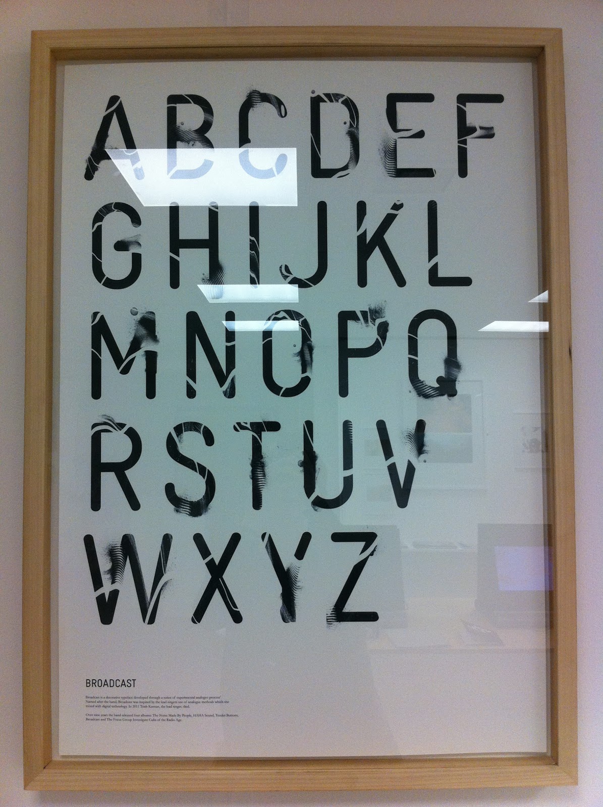
For starters, a beautiful new alphabet by Bryn Mackenzie...


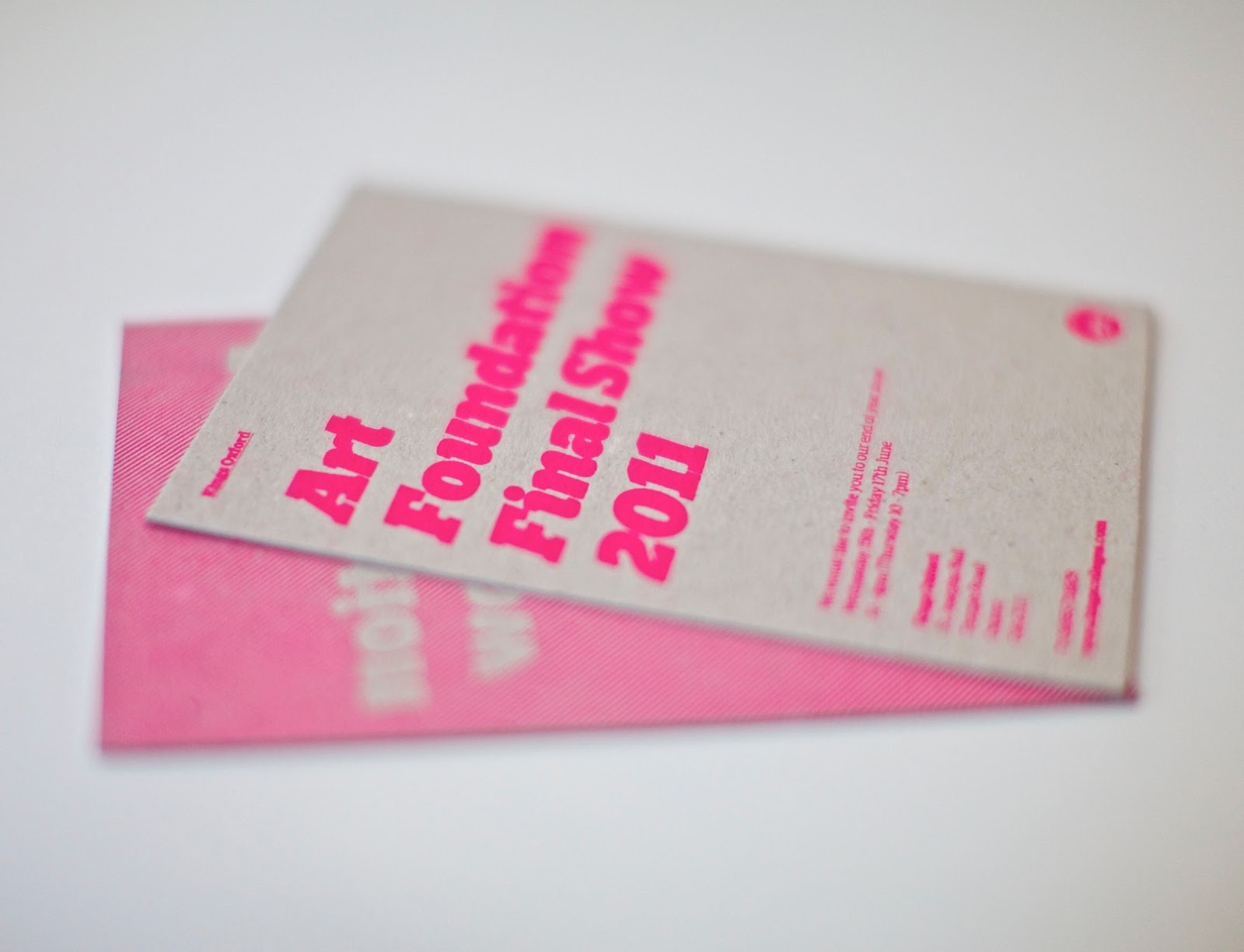
Shamefully, I didn't see the name of the graphic designer behind these beautiful pieces, but they were undoubtedly some of my favourites... (And my dreadful light reflecting images don't really do them justice either)


Katie Scott's gorgeous illustrations were another highlight...


Another illustrator whose work I loved was Pete Gamlen...


I first met Thom Bird midway through his final year, when I helped him cut out a selection of corrugated cardboard triangles. His paper and card exploits have continued and he has produced an amazing collection of final pieces.


I saw Charlie Sheppard's work earlier on this year, and the project which he's chosen to display is one of my favourites. The sports hall floor is so evocative and he created some beautiful posters to continue the theme.


Zöe Austin makes lovely photographic montages. Her postcard/business cards featured one of my favourites.


This is just a very small selection of the work at this year's degree show, and there is so much more amazingness that I couldn't possibly fit it all in one blog. Although you've missed their Brighton degree show, fortunately, there will be another show in London from July 8th – 12th at the Rochelle School. You can find more details on their website, and I'd highly recommend checking it out. We put on our London show at the Rochelle School too, and it's a beautiful setting for the work.

Now... on to the next year!

*It's only today I learnt the keyboard shortcut for ´... Learning doesn't stop at the end of formal education! I'm gonna be cliché, café and blaséing left right and centre from now on.)

LA local campaign

So, here's another little project I can show you...

Our college in LA wanted some local marketing materials, (posters, flyers etc), to be distributed in other areas of Los Angeles. Generally our marketing materials tend to revolve around bright, aspirational photography, but unusually, these were requested in black and white. Also, one of the great selling points of this college is it's incredible location, just off sunset boulevard, and only minutes walk from the 'Walk of Fame', and other central Hollywood attractions. This is an especially strong marketing point for people who already live in LA, as they'll know exactly where this is, and how great a location it is.

So we decided not to use photographs, like we usually would, and instead to work on a design which would centre around a map.

I LOVE maps, and very much enjoyed creating this isometric representation of the streets surrounding the college. We also used a recreation of Google's - now iconic - place marker, to show just where the college is


Here are some early layouts...


Ultimately, these were printed off on coloured paper, so that - despite saving on print costs - they still stand out on a wall of other black and white ads and posters. This bright colour, combined with the hard lines of the map and the bold text created something pretty effective.


Invitations.

It's been quite a while since I've written anything, and I'm sorry for that. It's genuinely not through lack of busyness though.

The day job is proving to be quite delightful, in terms of allowing me to actually spend my days working on interesting and fulfilling projects. However, quite often, I'm not actually able to blog about them until they've been 'released into the world', and by that point I've usually become distracted by the newest shiny thing I'm working on, and, as a result, never get round to showing you. I'm easily diverted.

Anyway, this was a quick, short project we did, and I can show you it now.
Our Oxford college runs an art foundation course, and they needed some invites for their final show.
We went for a simple, typographic treatment - it fits with the overall Kings brand, as we're using our brand typeface, and various style conventions, but we've gone easy on our use of the logo (settling for the simple circular version in the bottom corner on the back), which means that this piece is much more about promoting their show and their work than Kings as a brand.


The main challenge of this piece was actually finding a printer who could produce it. From the start, me and James were really keen on the idea of printing a fluorescent spot ink onto greyboard... it's a bit 'trendy', but I like it. For this effect to be achieved on a small scale (we only needed 100 invites), the only real solution was screen printing.

When at uni, we tending to think nothing of just getting something screenprinted, but in the real world, it's remarkably difficult to find a printer who uses this technique. After lots of research and plenty of dead ends, I eventually tracked down a lovely guy up near Haywards Heath (http://www.acresdesignandprint.com/) who was very helpful indeed, and managed to produce the invitations exactly to our specifications.

He was doubtful whether the flourescent ink would show up very bright, as - when printed on such an absorbent stock, he expected much of it would just soak in and fade away. But we were both delighted to find the invitations turned out just as vividly as we'd hoped for.


I really like the useage of greyboard in this context - for me, anyway, it has strong associations with my art foundation course: the back of sketchbooks, using it to build models, using it as a cheap cutting board and so on... it's a material I strongly associate with the 'behind the scenes' of creativity.

We actually got these done a couple of weeks ago, but I'd been waiting for our lovely photographer Wayne to take some nice shots of them for me. Thanks Wayne!