Well, inspired by, anyway.
I'm liking this today.
CD artwork for Steve Reich's 'Early works'
Monday, 23 February 2009
Saturday, 21 February 2009
Going all Michael Craig Martin (Only not as good)
Well, this Steve Reich album artwork project is proving trickier than I thought, and the deadline is rushing up at me, so I spent quite a while pondering today, and considering ideas for the four pp centre spread of my 16pp booklet. I wanted it to be based around the clapping song and the piano phasing song, and I was interested how in both songs, patterns appear and disappear in the music.
I drew this piano.
I also drew some clapping hands. Then, as you see below, did some nifty intermingling. (Is that even a word?)
I have been told off for being too literal though, so this may be bad.
Working progress. Click for full view.
I drew this piano.
I also drew some clapping hands. Then, as you see below, did some nifty intermingling. (Is that even a word?)
I have been told off for being too literal though, so this may be bad.
Working progress. Click for full view.
Tuesday, 17 February 2009
Friday, 13 February 2009
Better.
I had a pretty good crit, only one criticism from Siobhan, who thought that the images looked too mechanized... which is odd really, since Steve Reich's 'Early Works' music is essentially all about mechanization... And anyway, I did draw each line individually, so they're random and not perfect.
But yeah, overall they liked the idea, and I'm looking forwards to playing with different formats of leaflets, and more interesting text experiments.
Thursday, 12 February 2009
I think this project may cause nausea and seizures.
Producing some album artwork for Steve Reich's 'Early works'. Taken from Wikipedia, about the first track on the album 'come out':
"Reich used the voice of Daniel Hamm, at the beginning of the piece, he says: "I had to, like, open the bruise up and let some of the bruise blood come out to show them" (alluding to how Hamm had punctured a bruise on his own body to convince police that he had been beaten). Reich re-recorded the fragment "come out to show them" on two channels, which initially play in unison. They quickly slip out of sync to produce a phase shifting effect, characteristic of Reich's early works. Gradually, the discrepancy widens and becomes a reverberation and, later, almost a canon. The two voices then split into four, looped continuously, then eight, until the actual words are unintelligible. The listener is left with only the rhythmic and tonal patterns of the spoken words."
I'm interested in how the visual effect of moire is in many ways similar to the audio effects of Reich music, patterns shifting in and out of focus, and creating interesting, and sometimes quite difficult to look at/listen to.
Influenced quite blatantly by the soulwax artwork, which I've always thought was genius. Obviously that is a lot more subtle and amazing, and I wish it hadn't been done already, so I could do it first...
But boy does producing these things cause some nausea in me. I don't know how Bridget Riley coped.
This is a very rough version of an idea which will be perfected later if they like it in the crit tomorrow.
Update: below is another version... Rough, as I said, needs polishing round the edges.
Thursday, 5 February 2009
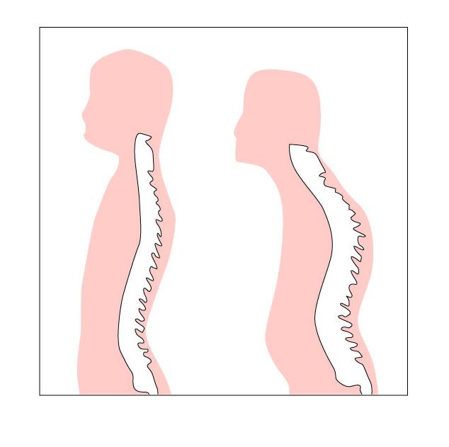
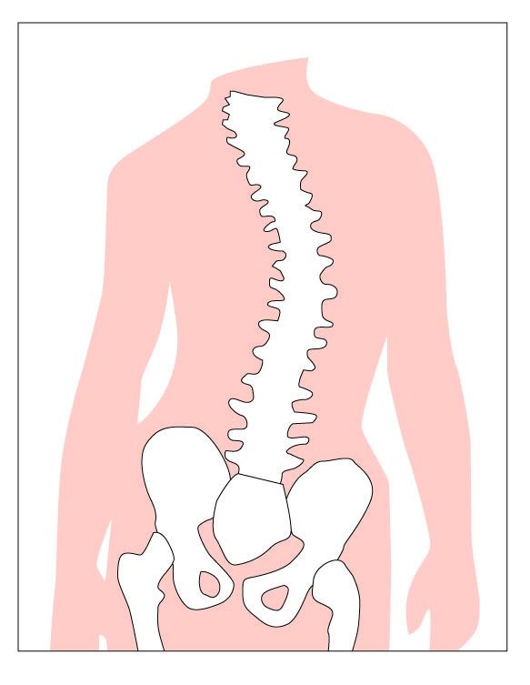
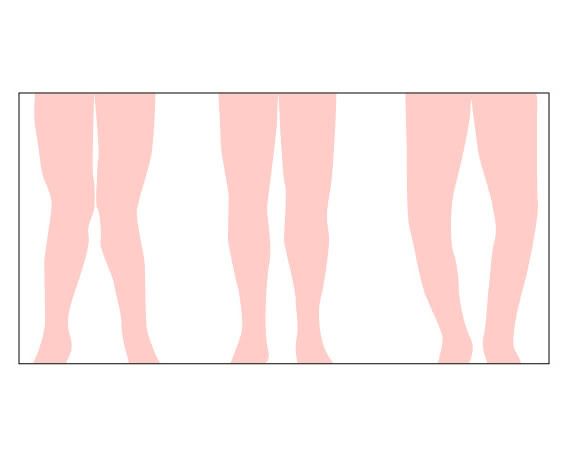
Valgus, Varus, Kyphosis.
I love Latin names.
I've been asked to do some diagrams for a medical video for Brighton uni.
I'm getting paid for these, which excited me greatly at first, although I've since been informed by my tutors that I've asked far too little, and really deserve a lot more for them. Still, a lesson learnt for future times, and to be honest, £40 for the lot isn't to be frowned at.
Basically, here are slouching and knock knees.
They may still have more work done on the, but considering they were going to use this paint monstrosity, I think pretty much anything I turn out will be better.
(Is that over confident?)
There's no text on them because the woman who's making the video wants to add that later. If you care, the first diagram is normal and kyphosis, the second diagram is... I dunno what the technical term is, but... wonky spine? And the third one is Varus, normal, and Valgus.
My friend Hannah...
...Writes a column in the student newspaper 'The Pebble', about art.
I'm having a go at doing her a nice page header! I have no idea whether this is what she had in mind, I was going for the classy, minimalist, cheap in printing ink look, although given the fact that it's a full colour newspaper, I might as well have gone crazy with the colours... I might give it another go later.
Here are three ideas, around the same sort of theme.
After some consulations, here are some improvements!
Monday, 2 February 2009
Subscribe to:
Posts (Atom)