Monday, 31 August 2009
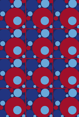
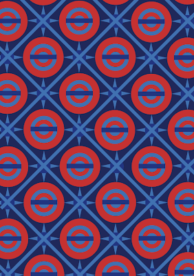
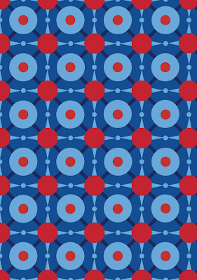
Another tube fabric design...

Wednesday, 26 August 2009
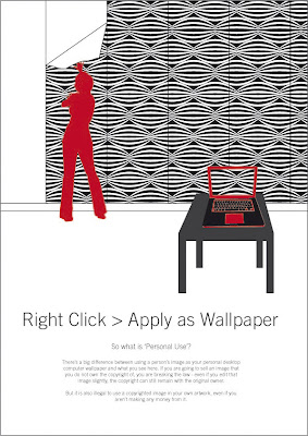
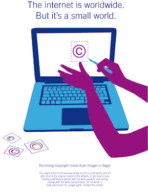
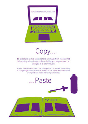
Copyright posters, continued...
Some new colour combinations too...
Visual Diary
 "I'm not here to shock or horrify or repulse you." (No, just to bore us.)
 Today I decided to draw every single crisp from the bag of crisps I ate.
 Went to buy a camera. The shop was closed.
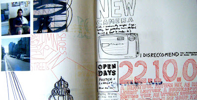 A beautiful autumn day
 New manifesto for happiness.
 I suck at typography today.
 Library staffroom and biscuits.
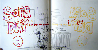 Sofa day :(
 Another ill day for me... and I've spent the day sleeping and drawing type.
 Christmas shopping...
 Type Stress! Floral day.
 A day which could only really be described as 'turned out a lot better than I thought it would'
 Broccoli goodness!
 In a bad mood, everything is annoying me.
 I really struggled to wake up today.
 A day in letterpress.
 In many ways, a very similar day to yesterday.
 Feeling financially stressed.
 Sunday.
 Not much happened today, so here's the contents of my handbag for you.
 I'm in a grumpy mood, but it's been a good day.
I should really have saved these and reposted them on the appropriate days this year, but I figured I'd only forget. :)
Thursday, 20 August 2009
TFL Fabric Design Competition
It's unlikely that I will, but I'm going to try my hardest!
My initial attempts are not promising. They're alright, but a bit boring. I'm going to try some more tomorrow and they will be more exciting, hopefully.
Monday, 17 August 2009
Copyright and the internet
I've really struggled to get going on this one, basically, we have to consider the positive and negative effects on the creative industries of internet sharing. I really wasn't sure what to do, and overall wasn't sure whether I feel positive or negative about it.
I mean, I disapprove of copyright infringement, and 'Art Theft' is absolutely unacceptable, but equally (pls don't come after me RIAA) I do have some music that may not have been obtained entirely legally. (Although on principle, I never download full albums, just individual tracks to get a taster - and since Spotify I've stopped doing even that...)
So I spent a long time pondering how I was going to approach the project.
And then, I came across the sad but intriguing story of Samantha Beeston, which you can read about here
Now although I feel bad taking something like this as 'inspiration', I was just amazed at the nerve of this girl, that she thought she could simply take other illustrators work, and shamelessly pass it off as her own.
Now I don't want to judge her, she may have actually felt enormous shame, and her case has been discussed in great depth in design blogging circles, so I'm not going to start throwing metaphorical internet stones.
But in reading through the comments on this particular blog post, I came across this comment (quite near the bottom of the page):
"08/10/09 10:36am tido wrote
I have this constant battle now with my art and design students [at foundation level] in getting them to fully understand and appreciate that the web is not a free resource supply for their designs. For a generation that have grown up with the internet there is actually a prevalent naivety about how far reaching it is. They honestly think that they can just take things and no one will notice, or even mind. They seem to think that if it’s an artist they haven’t heard of before then their old fogey lecturer [35] won’t have either.
There needs to be MUCH more emphasis on copyright issues and good working practice on all art and design courses, and lecturers need to remain informed about their field of work & the work of other artists and be quick to stamp on anything that looks like plagiarism."
And to be honest, I agree with him. Although I consider myself more informed on Copyright issues than the students he describes, I know I have a lot of learning to do. For example, what if I trace the silhouette of one person, in an image of several? (I work with silhouettes a lot, as in this project - I usually create my own images, but sometimes stock photos are necessary...) Do I have to contact the photographer? What if I'm only using the image for student work and not for profit? And this is just one scenario out of many others where I'm a bit clueless. In general, I play it safe, and have often sacrificed making something extra amazing, if there's a risk of me being tracked down and sued.
(And don't even get me started on the fascinating but slightly scary subject of cryptomnesia)
So, I've decided to take it upon myself to produce a series of educational posters, to be displayed at colleges, universities, public libraries - anywhere where there is open internet access, really.
Now, I have my idea, but haven't actually done the research I need to on Copyright, so the text at the bottom of these posters isn't accurate. But I wanted to get my visual ideas down, to see if they work.
I was thinking about how easy it is to just swipe something, or remove a copyright logo... right click > cut... Copy, paste... Apply as Wallpaper... and I wanted to create posters based on these ideas. So far, I present 'Cut', and 'Apply as Wallpaper'.
These need a lot more work, the colours aren't right (Although I quite like them) and obviously the text needs a lot more thought! But anyway, here they are, open to constructive criticism.
Oh yeah, and if anyone knows how to colour an existing pattern in Illustrator, let me know (The 'wallpaper' in the wallpaper poster, I want it to be the same purple as the table...)
Haha, and is that, in itself, a copyright infringement? I'm assuming those standard patterns in Illustrator are free to use?
Friday, 7 August 2009
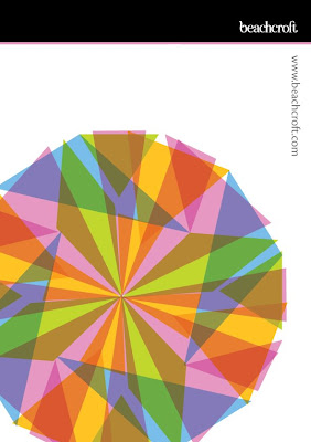
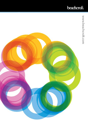
Many facets...
They wanted images which summed them up as a company, and I took their slogan 'Many facets, one face' as inspiration. The black bar at the top is part of their existing identity designed by 3fish, as are the colours used, but the images are my own.
I'm really pleased with these.

Thursday, 6 August 2009
Things I have learnt in the last four weeks...
1. How to colour up greyscale images in Indesign
2. Alt + Cmd + C
3. The importance of colour profiles (although not yet how to use them)
4. How to create custom gradients in Illustrator
5. How to set up PDFs to go for printing
6. How to use layers in Indesign and Illustrator
7. How to set up an image for varnishing/spot colours
8. Not to scalpel all the way to the edges when trimming down an image. You lose the crop marks, although this was blindingly obvious before, I only just had it pointed out to me.
9. How to set up an isometric grid in illustrator
10. Cmd + and Cmd -
11. How to make things exact specific heights in Indesign and Illustrator
12. The joys of 'multiply' and other effects
13. Cmd + z, cmd + z, cmd +z, cmd + z (And so on, into infinity)
14. That it's really a good idea to print crop marks
15. That I don't get travel sick if I sit on the floor of the train
16. How to organise and name files sensibly
17. How to move groups of anchor points in lines drawn with the pen tool
18. That answering phones is fun, and I enjoy using my 'efficient' voice
19. That clients can be incredibly fussy but you can usually meet their demands without losing all of your own creativity
20. The white arrow is confusing, but it is your friend.
Plus much more, I just hope all this stuff stays in my brain and that I can put it to good use!
I've produced some work I'm really proud of, and I hope to post some of it soon, but I'm still waiting to make sure I can.
It's my last day tomorrow, and it's been a tiring but amazing four weeks.


