So one of my new years resolutions was to start keeping a 'visual diary' again. It's something I've done several times in the past and always find a rewarding experience, but somehow always end up failing to maintain the momentum and usually only keeping it up for a month or so. Anyway, the same will probably happen this time, but I have managed a whole month without missing a day, which is pretty good going, I think.
A couple of my main motivations with this are to a) make sure I'm being creative on a day to day basis and b) to improve my general drawing skills, especially of people. Hence why there are some TERRIBLE people drawings throughout. Gotta practice, innit. Probably won't share those ones till I get a bit better though.
I'm also trying to improve my lettering skills, with a view to one day being like the incredible Jessica Hische (Yeah right)
Anyway, here are a few of my favourite January days.
January 6th. Curled up in Alex's dark room, watching him play computer games.
January 7th. 'Nuff said.
January 9th. Spent the day at work typesetting in unusual character sets. Massively confusing. But I love letters. All of the letters.
January 13th. I LOVE RUMMIKUB!
January 18th. Snow. Snow was so exciting that all I found time to do was make some slightly shoddy paper snowflakes. Also totally forgot to reference my mum's birthday (sorry mum)
January 20th. Sundays are good.
January 22nd. Seriously. It was SO COLD that chips were the only possible solution. #fatty
January 24th. Alex totally put on a shirt and tie and went and got a new job. <3 p="">
January 25th. So Diwrnod Santes Dwynwen (Welsh valentines day) and Burns night are totally on the same day. So me and Alex had a weird Diwrnod Santes Burns Night mashup where we ate vegan haggis and whispered sweet nothings to each other and then I got really bloated and lay around groaning because I shouldn't eat lentils but goshdarnit lentils are just so delicious I can't resist. #sexy
January 27th. We went up to London to meet Alex's new niece Lily. She's only 3 weeks old, and is BEAUTIFUL. I decided to try and draw her without much success. Trial and error though.
January 29th. Wayne (my co-worker, photographer) discovered an amazing function on his new camera that creates these incredible multi-burst photographs. We had fun.
Below is one of the results which I've heavily manipulated in photoshop. I love them.
More diary next month. Hopefully. If I keep it up.
Thursday, 31 January 2013
Friday, 18 January 2013
Experiences
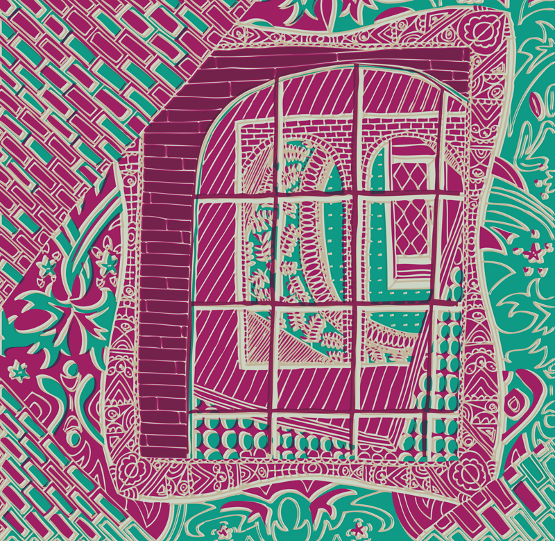
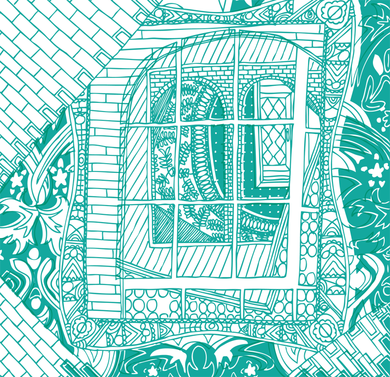
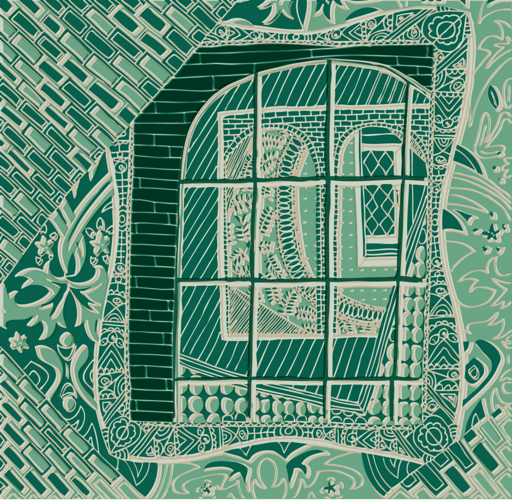
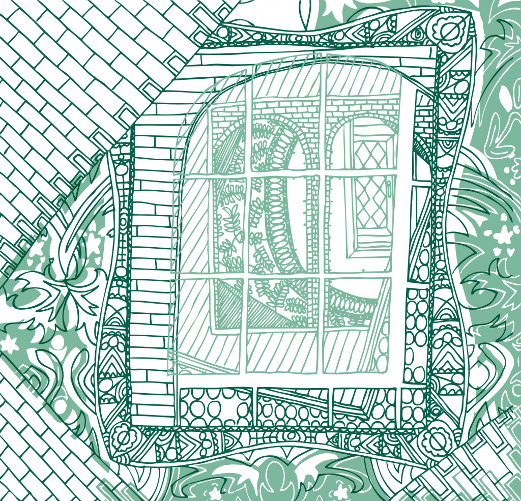
So here are a few variations on an illustration I produced for Alex. He's applying for a job. I can't really say more than that at the moment.
I don't even really want to say what these are about, but that doesn't particularly matter because they don't really relate to what they were meant to be about anyway.
That might be the most inarticulate blog I've ever written.
Anyway.
And here's the original linework...
I don't know how much I like these, but I enjoyed the process.
Wednesday, 9 January 2013
Skylark Housing Cooperative
So I've been very poor at updating this blog over the last few months, and there isn't really any excuse. While I've not been hitting the ridiculous heights of creative productivity I saw in my uni years, I've not just been sitting around watching the telly the whole time either. In fact I've basically stopped watching the telly at all, (AND IT FEELS SO GOOD) so where has all the time been going?
Well one thing that's been keeping me a bit busy is some freelancing for a local housing co-op which my partner Alex is involved with.
In case you're not aware of the concept of a housing co-op, here's a summary of why they're a GREAT IDEA. Basically, a group of people club together and find a house (often big and in need of a bit of TLC), and agree to buy it.
In order to put down the deposit they issue shares of 'loanstock' - basically this involves persuading people in invest in the co-op. They get their investment back over a period of 5 – 10 years, with added interest.
The way that they get paid back, and the way that the rest of the mortgage is paid off, is that the group of people pay a kind of 'rent' on the property they're now living in... Except rather than traditional rent which goes into a bottomless pit to an unknown landlord, this rent is going to pay off the mortgage on a shared house which is ultimately released from the usual downfalls of private sector renting.
Once all the loanstock has been paid off and the mortgage too (usually after 25-30 years), the house is owned outright, and the housing co-op continues bringing in money from a modest 'rent' - this can then be used to help start up other housing co-ops, or invest in another property for the same group of people. Obviously circumstances change, and anyone in the co-op can leave at any point and be replaced by someone else. Sounds pretty good, right?
Anyway, the difficult beginnings involve persuading people, organisations and other co-ops to invest, and I was asked if I could help create some slightly more professional promotional materials than what they had started work on.
I'm a great believer in the power of design to win hearts and minds (and investment of huge amounts of money from strangers), and for a small group like this, looking professional is pretty important if they want to reach their target amount in time. (It's looking good by the way!)
So I've helped create a range of pieces... flyers, posters and a hefty serious looking business plan document which gets given to investors. The illustrations have all been supplied by members of the housing co-op, and it was really nice to be able to incorporate their work into the final pieces in a professional way. (It also taught me some pretty mad photoshop skillz, as the skylark illustration supplied was drawn very faintly in pencil on a sheet of graph paper)
Here was the original idea, and below that the front and back pages of a 4pp A6 flyer which was distributed at a co-op fair.
Here are a flyer and poster used to promote open days where people could come and meet members of the co-op to learn more...
The business plan contains a pretty intimidating '40 year finance spreadsheet' which is probably the most complex table I've ever dealt with. I'm pretty proud* (*smug) with the end result, which looks a LOT better than the incredibly complicated colour coded spreadsheet which I got the original data from. (Click to zoom if you want to slightly more fully appreciate its ridiculous complexity)**
And here's a page from the business plan incorporating some of the co-op members illustrations...
I think the little portraits are super sweet :)
On the offchance you're wealthy and feel like investing in a really positive local project... Get in touch! They're still looking for investors!
** On a side note, I feel like a bit of a loser for admitting this, but one of my favourite things about the project was what would probably normally be considered the most dull - making that incredibly complex 40 year financial plan look good. It took a LOT of thought about how to make it logical and clear, and I'm so pleased with the end result! I've been getting properly into creating tables in InDesign (I have to do it quite a lot at work) and it was great fun to be let loose on one of my own which I could style as I wanted!
Subscribe to:
Comments (Atom)


