This weekend I had the delight of attending one of
Mike Meyer's 'Better Letters'
workshops in London.
I've wanted to go to one for ages, and as this time it coincided with my birthday I decided to treat myself. I've loved hand lettering since I could first pick up a pen, and although I've never reached expert level in any form of lettering, I have ended up pursuing a career which involves working with letters in their visual form every day, and I felt like this would be a great opportunity to up my hand-lettering game.
On the Friday morning, we started off by looking at block gothic sans serif letters — initially, sketching their outlines accurately ready for painting. Although we spent a lot of time looking very closely at letterforms on my degree, and often attempting to hand draw them, this was the first time I'd ever had any practical instruction on the actual construction of letters, rather than effectively being told by uni tutors to 'just look at it really hard and then copy it'.
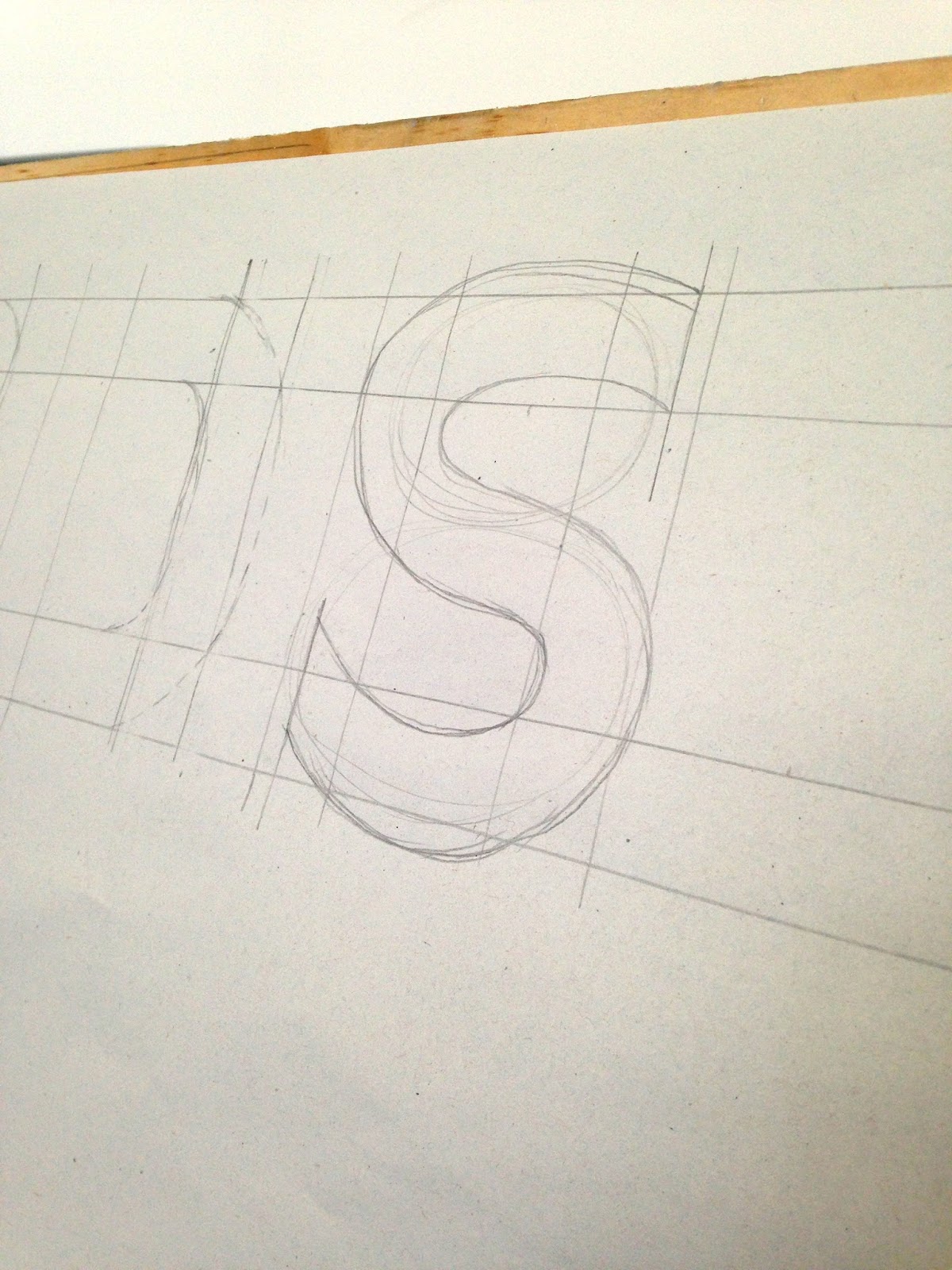
I started off with my name. Obviously. Got a bit jealous of other people on the workshop who had way more interesting typographic names like ‘Hermione’, ‘Clement’ and ‘Ruby’. I HAVE NO CURVES!
Had a go at an 'S'. Pretty pleased for my first attempt...
Mike Meyer came over and swiftly, perfectly painted a few of my letters. 'Well, this should be easy enough!' I think to myself.
Side note, the soap in the toilets for handwashing were these crazy soap-on-a-pole contraptions. Initially I was like 'kinda cool', by the end of the weekend, I HATED THEM
Anyway, I got to painting. The paint we were using was incredibly satisfying oil paint, thinned with white spirit. It went down a perfectly smooth, opaque black and dried within 5 minutes. Mmmmmm.
The main struggle I found was finishing off the strokes tidily. It involved a very particular twist of the brush that it took quite a while to master.
(When I say 'master', I mean 'become vaguely competent at'. This guy was the master.)
People might have thought I was kind of strange because I inadvertently wrote the word 'womb' while picking random letters.
We also did some 'thick and thin' block gothic, which I enjoyed a lot.
This next morning we started learning 'casual' style.
I enjoyed this! Here's some signage for my imaginary cafe...
And for the Brighton tourist board... (Mike Meyer lettered the word 'Brighton' for me, which is why it looks so good)
A lot of it was about learning the stroke order, which has been really helpful...
But then hubris kicked in and I made loads of mistakes.
Those E’s should slant! That kerning is all off! So’s the leading! My T’s are too tall! One G is way too narrow! Oh well.
In the afternoon we moved on to script. I'd been looking forward to this because I love doing script, but with some trepidation because inking curves is HARD and script is basically all curves. And I was right.
That ‘C’ stroke you see there is the starting stroke of so many letters… it can become a g, a d, an a, an o, probably others… And it should have been the simplest thing, and yet…
I did a LOT of those C's and to be honest I never really nailed it, so to lift my spirits I started doing some more free-form stuff.
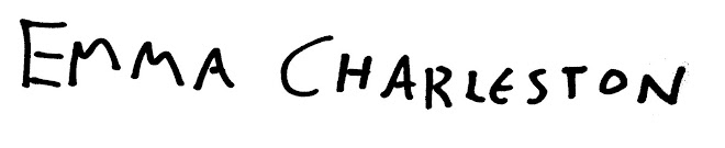
First a bit of name vanity. I’ve never liked my surname but at least it has more interesting letters than ‘Emma’
Another exercise we got to do was painting onto glass (effectively tracing, but also learning a bit more about what glass is like to work on). Fun trivia, this framed piece of glass was originally created by a photography studio for part of a concept shoot in which Aphex Twin would push his face against it to contort it into horrible shapes. But he changed his mind and went with the elastic band thing instead so it never got used. (He wrapped elastic bands round his face then photoshopped out the elastic bands, with unsurprisingly grim results)
Because I'm actually an adult now, I didn't tell anyone there that it was my birthday. (Because the thought of being sung to by strangers kind of fills me with dread). I did, however, wish myself a happy birthday typographically.
And it was an excellent way to spend my day.. Even if it's not viable for me to quit my job and re-train as a traditional signpainter (although if anyone hears about any evening classes I would genuinely love to learn more), it's been great to learn more about letter construction and hone my painting skills a bit. I would highly recommend it next time he's in town for anyone who loves lettering!